Are you looking for a list of landing page optimization tips to boost your conversions?
With so many things that can affect conversion rates, it’s often difficult to know where to begin to fix an underperforming landing page.
So in this post, we’re going to go over the top 14 tips industry pros use to maximize conversions and get the most out of their marketing campaign.
Before we begin, however, we need to make sure we’re both on the same page (no pun intended).
What is Landing Page Optimization?
First of all, a landing page is not your home page, about me page, services page, or any other part of the website’s navigation.
A landing page is a standalone page with only one purpose — to get visitors to take a desired action.
That action could be buying something, subscribing to a newsletter, downloading a report, or any number of things.
Therefore, landing page optimization improves elements on your page to maximize the chances a visitor will act.
Why is Landing Page Optimization Important?
The landing page is vital in the buyer’s journey, as every unconverted visitor means money left on the table.
Not only that, an underperforming page can cause:
- Lost sales
- Higher marketing expenses
- Loss of future customer engagement
Even if the rest of the customer experience is world-class, you’ll never get a chance to show it if you can’t get a visitor to convert.
In fact, according to WordStream, the average landing page conversion rate is only 2.35%.
Yet, landing page optimization is a never-ending battle. No matter how well your landing page performs, it can always do better.
Luckily, we are here to help turn around your fortunes with our best practices.
14 Tips to Optimize Your Landing Page & Boost Conversion Rates
Below we’re going to show you the best landing page optimization tips that’ll help you avoid mistakes and make your page hum like a well-oiled machine.
1. Unclutter Your Page
When it comes to landing pages, less is more.
Your landing page needs to be concise, precise, and action-oriented.
You want the reader to only focus on your value proposition and the action you want them to take. Unnecessary graphics, text, and options competes for their attention and confuses them.
Ask yourself:
What do you want them to know?
What do you want them to do?
Make it clear.
Keep it simple.
For example, here’s a cluttered landing page from Multi Touch:
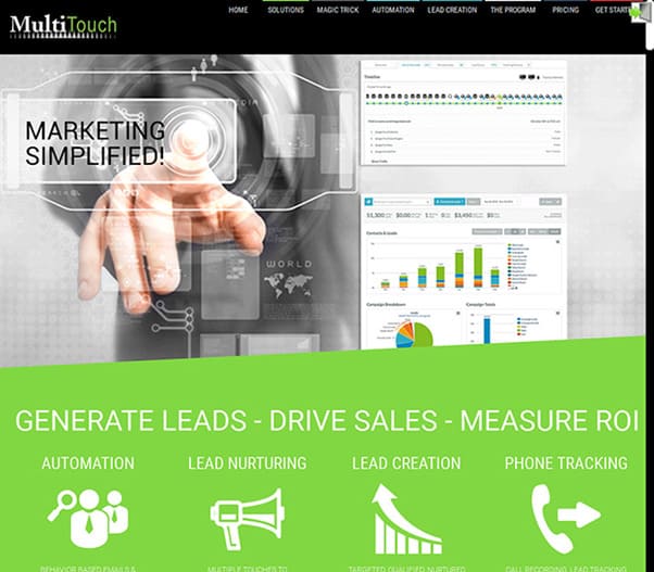
With so much going on, it’s difficult to distinguish where the marketer wants the viewer to focus. In fact, what do they want them to do? What are they trying to accomplish?
Compare that to this uncluttered landing page from Sundae:
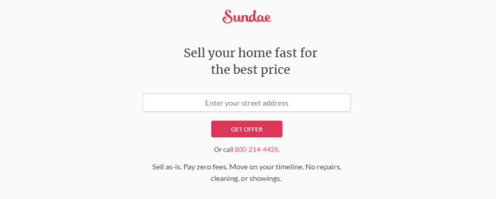
You can clearly see the action they want the user to take: “enter your street address” to get the offer.
Essentially, minimal text. Clear instructions. No competition for your focus.
2. Be Mindful of Mobile Optimization
According to Statista, 58.99% of all web traffic is mobile and that figure grows every year.
With so many people using mobile devices, you need to make sure their experience on your landing page is positive.
Over half of users said that a negative mobile experience made them less willing to engage with a company.
Yet, it can be difficult to optimize for mobile — what looks good on a desktop, may utterly fail on a smartphone or tablet.
Take a leaf out of Shopify’s book. They do an excellent job of adapting their desktop landing page to mobile:
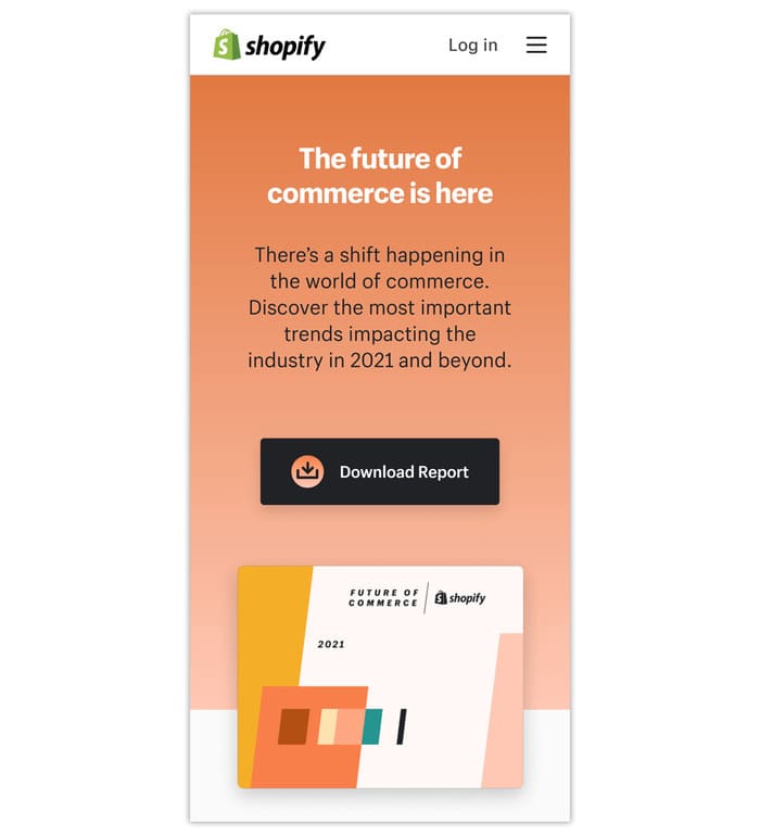
Even though the resolution is smaller, everything important is present. It’s easy-to-read, the instructions are clear and the call-to-action stands out.
3. Supercharge Your Page Speed
Slow loading pages kill conversion rates.
In fact, every second of load speed decreases your conversions by 7%.
Ideally, it should take no longer than 1-2 seconds for your landing page to load. Otherwise, your (impatient) content-hungry readers will bounce without ever knowing your offer.
But how do you know your page speed?
Google’s PageSpeed Insights is a free tool that allows you to insert your URL for both mobile and desktop.
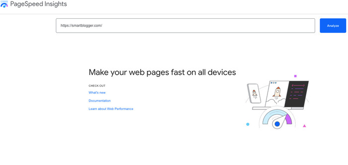
After entering your URL, press “Analyze.” You will be greeted with an array of statistics to help you judge your current page speed and where to improve.
4. Keep The Super Important Stuff Above the Fold
The term “above the fold” refers to a newspaper where the most important stories were on the top half of the front page.
In the internet age, that means putting the most important stuff at the top of the web page so the viewer doesn’t have to scroll down.
Why put your most important content at the top?
Here’s how much people read when encountering a four-paragraph web page:
- First paragraph: 81% of the time
- Second: 71% of the time
- Third: 63% of the time
- Fourth: 32% of the time
While people are more likely to scroll down today than in the past, you’re not writing a news article. You’re trying to get the visitor to perform an action.
The more work you ask them to do, the less likely they will do it.
100% of the visitors will see what’s above the fold, but what should you display?
Every brand is different, but the most essential components are:
- an attention-grabbing headline,
- a few words of supporting text,
- a relevant graphic,
- and a call-to-action.
Take this great example from Wistia.
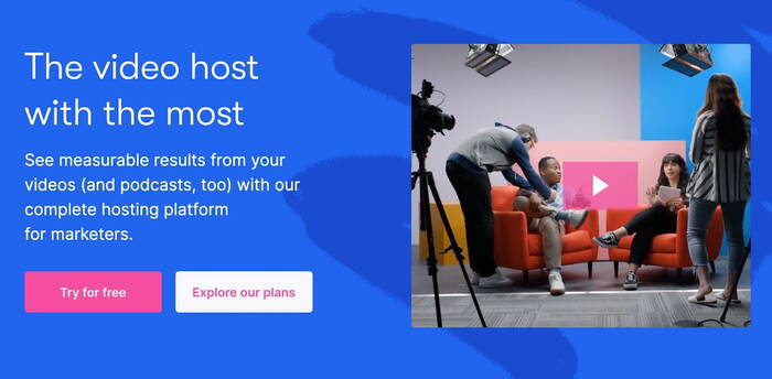
Notice how all the relevant information is present without the need to scroll down.
5. Stand Out With a Clear, Benefit-Driven Headline
The most important part of any landing page is the headline. If it isn’t attention-getting, the visitor will never bother reading the rest of your value proposition.
David Oglivily stated:
Essentially, eight out of ten visitors will read your headline, but only two out of the ten will read the rest of your content.
Yes, your headline is that important. And you only have a fraction of a second to create a lasting impression.
When creating a headline, consider how you’re going to help the visitor resolve their biggest pain point.
For example, MySugr creates a punchy headline in just five words.
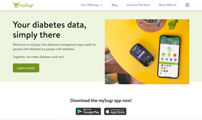
They’ve identified their target audience’s primary pain point of having a simple tool to manage their diabetes and provided the solution — an app.
And here’s another tip for supercharging your headline: use power words.
6. Create a Stronger Connection With Relevant Images
In an age dominated by content, brands are constantly competing for customers’ attention.
Yet, your landing page can stand out amongst the crowd.
Having relevant images in your content gets 94% more views compared to those without.
The key here is relevant images.
In other words, the image should reinforce the message you’re trying to convey.
Images that show people using your product or service work best. Take a look at the example from Dollar Shave Club below.
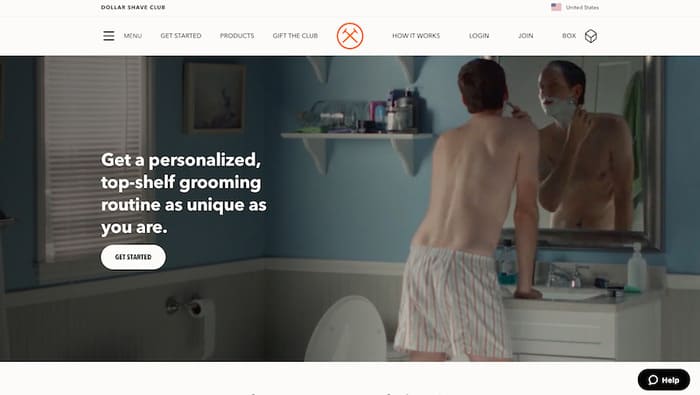
What could be more relevant to a company that sells male shaving products than a photo of a man shaving?
To learn more about how to get the most out of the images on your landing page, LanderApp provides a good tutorial.
7. Create an Even STRONGER Connection With Relevant Video
If you’re not using videos on your landing page, you should definitely consider it.
According to Growth Marketing Pro, Landing page conversions increase by 86% when videos are present.
Video allows you to communicate in a way that words alone cannot.
It doesn’t have to be a very long video either.
A 30-45 second clip of a satisfied customer or a short explainer video will help emphasize the value of your offer. Also, it makes you appear more human in the viewer’s eyes.
This landing page attempts to overcome the natural reluctance of people to fill out the contact form with a video.
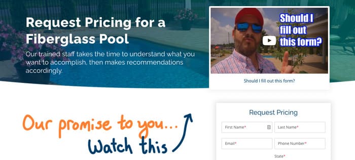
Not only does the video stand out on the landing page, it uses a creative way to overcome a primary pain point.
8. Empower Your Brand With Visual Consistency
A landing page is not some random thing thrown onto the internet to get a click.
It is an extension of your brand.
Visual consistency is part of a brand’s identity and provides potential customers a frame of reference.
For instance, if you have a Google ad, social media post, or any other digital marketing source to get to your landing page, they should be visually consistent.
Each of these should have consistent imagery, fonts, and colors as it tells a potential customer they’re dealing with something familiar.
Never forget:
You’re not just selling a widget. You’re selling an experience.
So, make that user experience as comfortable and frictionless as possible.
For example, Dashers (Doordash delivery people) use smartphones to get delivery orders and keep track of their earnings.
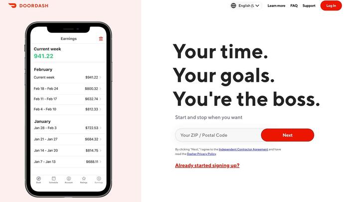
The landing page design uses a photo of a cell phone with a relevant display of Doordash data to stay consistent with a user’s experience.
9. Streamline Your Lead Form
Nobody likes giving information to strangers, especially when it’s perceived as intrusive and unnecessary.
Therefore, be mindful of how much information you ask for on your lead form.
It’s understandable why you would like to know as much about a visitor as possible, but asking for too much information upfront makes people uncomfortable.
So, reducing the number of fields on your sign-up form will increase conversions.
But how many should you have?
According to HubSpot, the ideal number of fields on a form is three.
Notice how this sign-up form from Chobani only asks for the basics — first name, last name and email address.
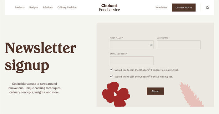
They have maximized their chances of gaining a lead without alienating the visitor.
10. Zone In On Only One Offer
A confused mind always says no.
It’s tempting to communicate as much information as possible. Yet, when you have the prospect’s attention, it’s better to focus on only one offer at a time.
According to Growth Marketing Pro, multiple offers on a landing page reduce conversions by a staggering 266%.
Notice how CodeAcademy only wants you to sign up for more information.
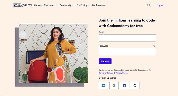
They could add a discount code or a trial offer, but it will deter the prospect from the initial reason they landed on the page.
11. Catch the Eye with Amazing Testimonials
Nothing beats the power of social proof.
Studies show that 97% of consumers read product reviews when making a purchase.
So, you can’t afford not to have testimonials.
While a bland testimonial is better than nothing, a testimonial that reflects how your product or service helped a user overcome a pain point shows that you’re trustworthy and can deliver results.
To learn more about harnessing the power of testimonials to maximize conversions, check out this post from VWO.
Below is a great example of how to use testimonials on your landing page.
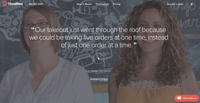
ChowNow incorporates a photo of the people giving the testimonial and an easy-to-read narrative for social proof.
12. Entice Prospects With a Clear Call to Action (CTA)
A reader should never be confused about what action you want them to take.
Make it clear what they have to do and don’t be shy about instilling a sense of urgency.
Some good examples of a clear call-to-action (CTA) are:
- Download Your Free Report Here
- Schedule an Appointment Today
- Limited Time Offer. Join Now.
Yet, they can fall flat if they don’t stand out.
Try contrasting colors to emphasize the CTA button and don’t be afraid to test color combinations to see what works best for your audience.
But if you want to take it a step further, personalize your CTA.
Hubspot found that personalized CTA buttons increase conversions by a whopping 202% over default wording.
Spotify takes a simple approach with it’s CTA. After all, who doesn’t like free?
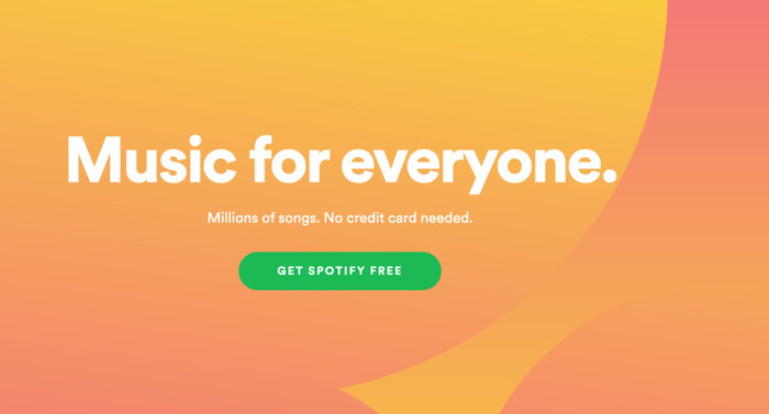
Notice how the action button contrasts with the background but isn’t overbearing. It’s subtle yet effective.
13. Boost Your Page With SEO
While search engine optimization (SEO) doesn’t play a key role in landing page optimization, it is an important piece of the puzzle.
Ultimately, if people can’t find your landing page, you’re not going to have any conversions.
Finding your landing page through a search engine represents a no-cost way to reach prospects. Unfortunately, this method has lots of competition, even if you use a Google ad.
Nonetheless, consider what words and terms your target market uses in search engines and incorporate those into your text.
For example, if your page focuses on reading glasses, keyword research reveals the following terms to be added to your copy:
- Reading glasses
- Women’s reading glasses
- Men’s reading glasses
- Best reading glasses
Weave them into your landing page copy in a way that sounds natural to your audience.
14. Know What Makes Your Audience Tick With AB Testing
Only 58% of businesses use AB split testing for conversion rate optimization.
The more often you test different options, the more likely you are to arrive at the best combination for your audience.
AB testing should not be a one-time only thing either.
The marketplace is always changing. The quality and focus of your offer may have to change with it.
Do you have the right message for the right audience at the right time?
You’ll never know unless you AB test.
Tweak only one variable at a time. If you try to change too many things at once, you’ll never know which change had the effect you observed.
Landing Page Optimization: The Next Steps
As we mentioned above, landing page optimization is a never-ending process. No matter how well your page converts today, it can always do better tomorrow.
Even small gains add up over time.
Armed with the knowledge in this post and a burning desire to squeeze every conversion possible out of your landing page, you’ll be well on the way to boosting your conversion rate.
Now go out there and implement these landing page optimization best practices.



Hi Stephen,
Great tips on increasing Conversion rates; I agree, minimal and clutter free design works very well. So does a fast loading web page!
Thanks for sharing!